Simplify Servicing and Drive Operational Efficiency with LoanPro’s Upgraded User Experience
UI Upgrades
An intuitive, modern, and simple user interface and experience are essential for servicing. Whether you service loans, leases, lines of credit, or credit cards, LoanPro’s modern user experience is configurable, easy to navigate, and will improve your agent, back-office, and borrower experiences.
Most recently, LoanPro has been working on several valuable updates to the agent experience portal that we’re happy to announce today.
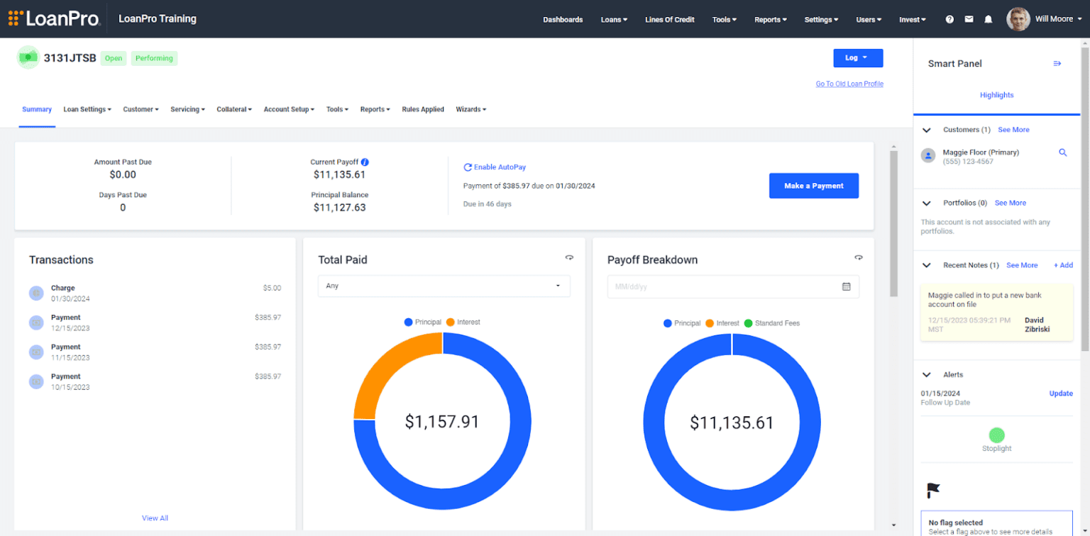
One of LoanPro’s three commitments is customer delight. To fulfill this commitment, we have a team of dedicated researchers who are constantly talking with our customers and end users of our platform to understand ways to improve our software and increase operational efficiency. Through hundreds of interviews and user testing with agents, we’ve upgraded the agent experience to drive operational efficiency and help agents feel more confident while interacting with borrowers. This empowers the ability to reduce the time that agents spend navigating within a loan or credit account and making the most-used tools and data more visible and easier to use.
These updates will be released to existing customers on January 15th and include the following improvements focused on agent experience operational efficiency:
- An upgraded loan view to simplify navigation and open up more room for relevant graphs, content, and stats
- A persistent Smart Panel to keep the most-used information and features easily accessible across all loan screens
- A configurable loan summary to keep the most important information at your fingertips
- A new loan manager experience that balances elegance with ease of use
- A streamlined first-time login experience that easily onboards new agents
Upgraded Loan View
When redesigning the view within a loan, we were able to draw on feedback received to take less screen real estate with navigation, and give that space to data and features. To accomplish this, we moved the loan menu, which used to be on the left side, to the header to simplify navigation and open up more room.
In addition, the loan header has been simplified and a shortcut has been added so agents can log transactions from any loan screen at any time.
Smart Panel
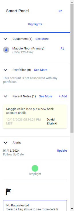
Perhaps the most significant innovation in the new user experience is the smart panel. This panel contains all the essential information about the loan, and is persistent across all loan screens. It displays information on how the loan is grouped, who the customers are, collateral information, and recent notes or alerts. New notes can also be recorded in the smart panel, so navigating to a specific screen to take a note is no longer necessary.
The Smart Panel includes links to loan pages in case more information is needed about the data displayed. And don’t worry, the Smart Panel can be collapsed if needed to open up more space on the page.
This is just the first version of the Smart Panel. In future releases, the data and tools displayed will be configurable, and multiple versions of the smart panel can be created and shown depending on the user or loan in which it’s displayed.
Configurable Loan Summary
The loan summary is now more configurable than ever before! The new configuration includes interactive widgets that show the payment breakdown, payoff, loan transactions, and delinquency information. It also includes the ability to create custom data widgets that let users decide what information to display.
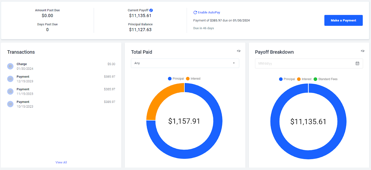
Multiple loan summary configurations are allowed, and LoanPro’s Automation Engine allows business logic to dictate when different views are displayed, based on loan conditions and the agent accessing the loan. This means the view can be different for servicing agents and collections agents, or even different if the loan is delinquent or close to payoff. With this added configurability, many servicing calls won’t require navigation away from the summary page, saving valuable agent time.
New Loan Manager
The new loan manager falls into the same category of upgrades introduced to make servicing more efficient by providing a better agent experience.
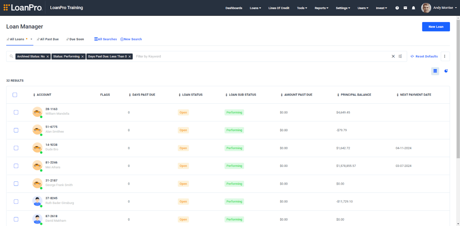
The new loan manager offers a simplified search view that is completely contained within the primary search bar. This view helps agents clearly see which search filters are applied, so it’s clear which search results the loan manager is showing. Frequently made searches can be pinned to the top of the loan manager so searches are quicker.
Because the robust list of search filters is now expandable with a single button click, it’s easier to see information about each account and more convenient to choose search filters. The new view of accounts highlights loan statuses, and always includes customer names in the first column.
Bulk actions are much easier to perform on accounts with a persistent checkbox to choose which accounts to contact, send to a servicing or collector queue, etc.
Streamlined First-Time Login Experience
Finally, LoanPro has simplified the first-time login experience to help our lenders onboard new agents. Now, setting a password and logging in for the first time is a two-step process. This simplified process was designed to decrease the amount of time it takes for a user to log in for the first time, and will lead to less questions and less unsuccessful access attempts.
LoanPro is continuously working to provide value to lenders, whether it be through features, technology, connectivity or experience. We are passionate about providing a powerful, scalable, modern credit platform to efficiently service any class of credit product.


